->Groovy
Designing the groovy logo was an exciting process. I started with brainstorming sessions, gathering inspiration from retro designs and vibrant colors typical of the '70s era. After sketching a few concepts, I settled on a bold, funky font with swirling patterns and a lively color palette.
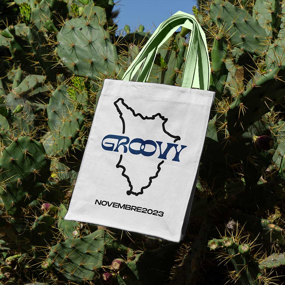
We launched the tote bags as part of a fundraising campaign, promoting them through social media and at local events. The response was overwhelmingly positive, with many people appreciating both the design and the cause. The funds raised will support our ongoing projects, making a tangible difference in the community.
For the fundraising tote bag, I wanted something practical yet stylish that would appeal to a wide audience. I chose a high-quality, eco-friendly cotton material to align with sustainable values.
->Logo
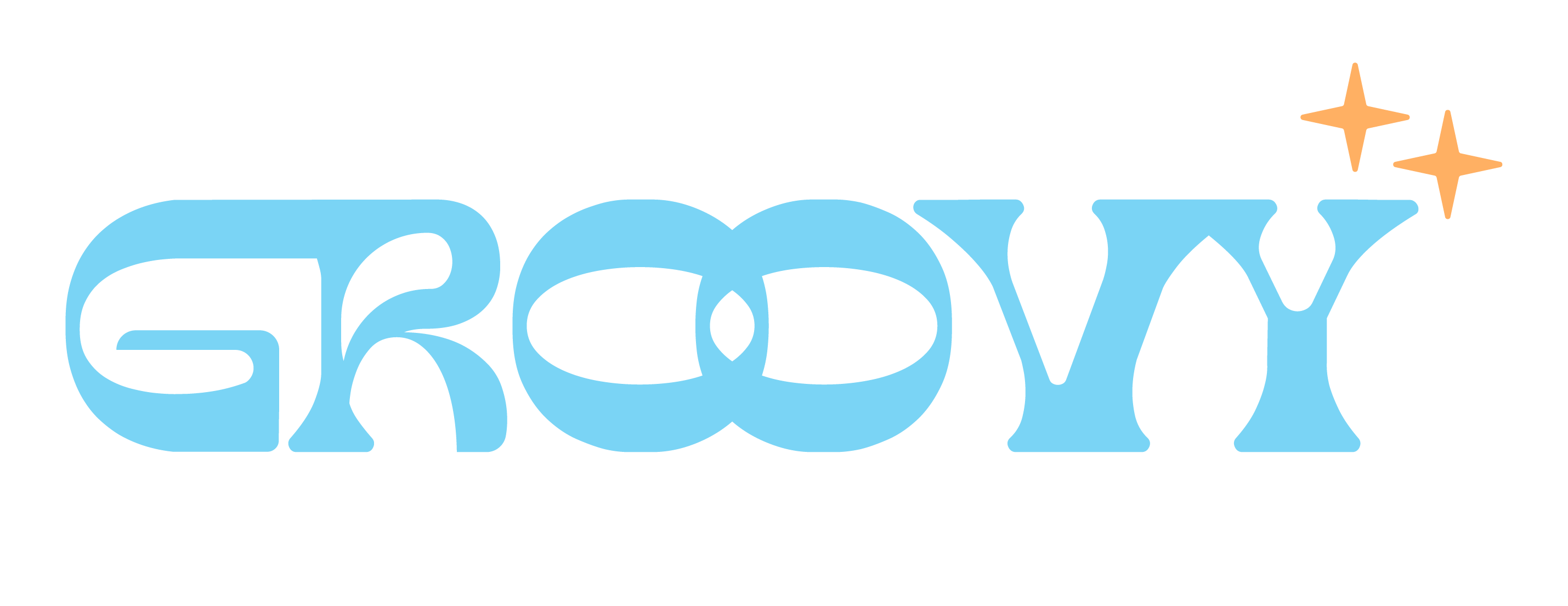
The use of blue and yellow in the design was a deliberate choice to convey specific emotions and messages. Blue is often associated with trust, calmness, and reliability.